
We may not judge a book by its cover, but we always judge a business by its website. Over the years, we have come across such worst website designs that have made us question our own aesthetic sense. While some of them have left us in splits, others have made us cry out loud in frustration!
A bad website design may not always involve gaudy elements and horrible images. Sometimes the lack of user-friendly navigation is more than enough to make us leave the site.
Here’s a list of such 50 bad websites in the year 2023 that will leave you shocked with surprise! This list of worst websites can tell us what design mistakes we must avoid at all cost.
What Makes for Bad Website Design?
The design of a website encompasses a number of elements such as its layout, colour contrast, typefaces, and navigation menu. So, to understand what a bad design means for a website, you’ll need to know the signs that a user may find your website uninteresting.
- Cluttered Text
If the website has too much text, any visitor will find it overwhelming. It’s not just that they won’t take time to read through everything, the website will look too clumsy and hard to navigate, which will discourage them considerably.
Here’s a hard-hitting fact about the human brain — if it senses that a task is too difficult or would be taxing, we tend to shift to the next best solution. So, you’ll need to make sure the website copy is concise and speaks to the persona of the buyer.
- Slow Site Speed
Site speed refers to the time that pages take to load on the website. So, if your site loads slowly, that might frustrate users trying to access the site on any website. Do note that you can find out the site speed using a range of free tools such as PageSpeed Insights by Google and WebPageTest.
Here’s how the PageSpeed Insights Test works:
Step 1: Type the URL of the web page you’re willing to test
Step 2: Select the “Start Test” option, after which the program will run the test for a couple of minutes.
Step 3: On completion of the test, you’ll get to see the web page loading time in seconds.
- The Design isn’t Mobile-Friendly
A website that’s not mobile-friendly means the page format seen on a smartphone is no different than when a user is viewing it on a desktop.
This implies they’ll have to zoom in manually and shift all around the web page if they want to navigate. The content will be too small to read, with the images falling off and the navigation not visible clearly.
- No Whitespace
Although a few internet users consider void space or whitespace as wasted, that isn’t quite justified, especially in the case of websites.
Whitespace provides a visitor’s eyes with the much-needed break while they’re going through an entire page. It can also be helpful in breaking up the visitor’s thoughts intentionally so that they can better understand the message and digest the content. Otherwise, the eyes might not be able to follow the text consistently.
- Unclear User Journey
After your visitors are done glancing through a page, you wouldn’t want them to think “Now what?”. So, having an unclear next step isn’t just confusing to the end-user as it can make them disinterested and may lead them to skip viewing the rest of your site. Needless to say, this would mean a missed opportunity for you.
That’s why you should think of the purpose of every page when building a site. Find out answers to questions like – Do you want to educate visitors about the services your business offers? What information are they looking for? What would be the following step in their journey? Remember that you’ll have to be intentional here, and guide the visitors to become a lead.
That was all about the signs indicating all’s not well with your website design.
Now, here’s the complete list of 50 bad websites:
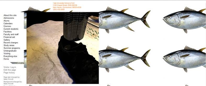
When the website belongs to Yale, we expect something extraordinary. But this particular website leaves your senses assaulted especially because you expect an art school to have a website that’s more appealing to your visual senses. For a moment, it leaves you wondering if you are in the right place since come on, it’s Yale we are talking about!
This website uses Ruby on Rails and is programmed by the faculty and students quite often. But the tiled images in the background and the horrible font choices are simply inexcusable. The navigation is pretty user-friendly but the ghastly use of manga and pop animated backgrounds are enough to put you off.
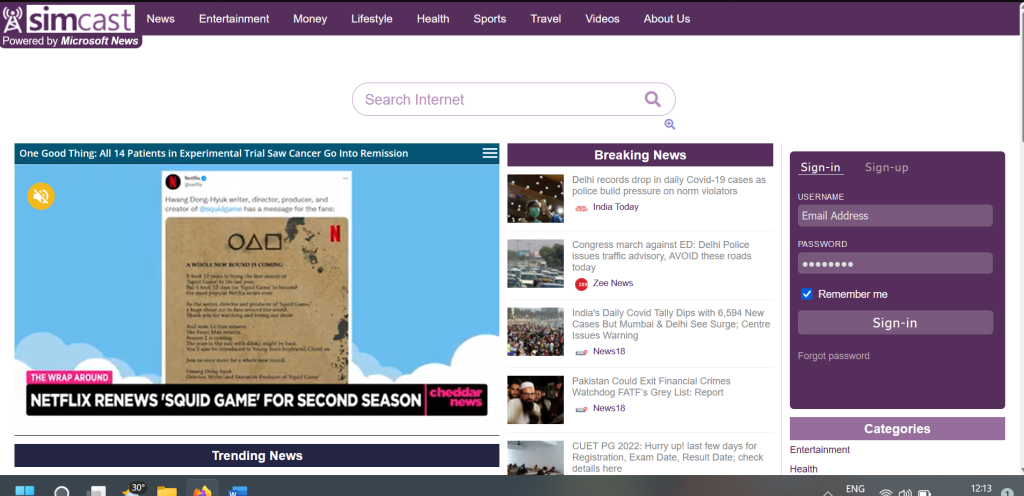
Simcast may be powered by Microsoft, but it often ends up on the worst website lists. The poor color scheme and outdated design is its most notable flaw. There’s too much text and the navigation on this website is far from stellar. The website has nothing that will grab a visitor’s attention and keep them hooked.
There is room for improvement, of course. An updated theme and more streamlined content will make it look less like the Yahoo! of the yesteryear and more like something that belongs in 2023.
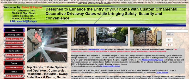
The website is archaic in terms of technology as it’s just safe to say that the designers have not heard of responsive templates. The color combination may be a secret homage to the Confederates, but sure as daylight, it makes you want to put those shades back on. The entire page is overcrowded, and the content is not arranged on different pages. In fact, you need to download PDF files to be able to read the content of each page. As far as we can tell, the website is using the wrong layout. They can go with a WordPress magazine theme/template for better results.
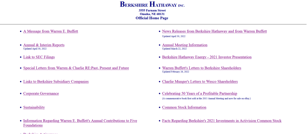
Who doesn’t know Berkshire Hathway? One would expect Warren Buffett’s company to have a much better website but that’s not the case here. The issue is immediately noticeable. There are no images to grab attention, the background is bland, and there’s no clear content, just a list of links. The page feels very basic and minimal, but not in a chic way. Unfortunately, this page doesn’t really inspire trust either. Looking at it, one wouldn’t think the website belongs to such a powerful and influential company. While minimalism is a good thing, it is possible to make the website feel a little too minimalistic.
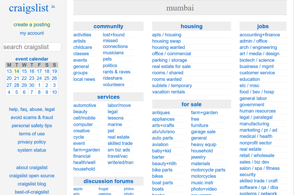
Craigslist is very popular and has somewhat of a dubious reputation. The website does nothing to fix that reputation. There is no content to draw people, no images, the website theme seems outdated, and even the font feels old-school.
Like many sites on this list, this one seems unreliable and untrustworthy as well. That’s one of the reasons why Craigslist is in our bad websites list.
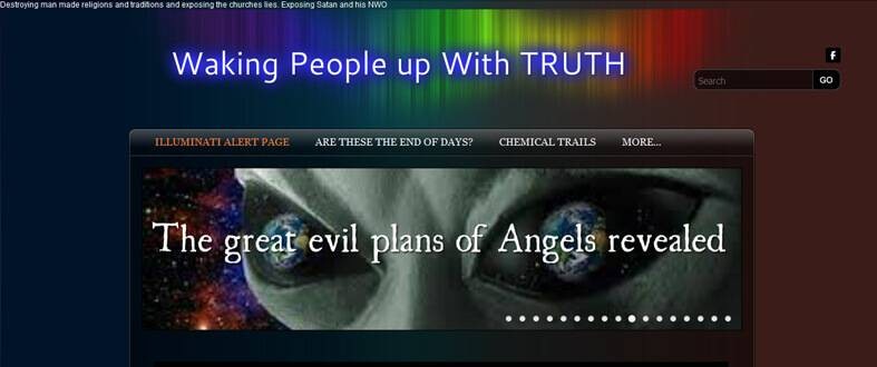
The name surely does grab a lot of eyeballs, but the website will make your senses scream in physical pain. They may be thinking about waking people up from the slurry of conspiracies, but honestly, the designers should have woken themselves up completely before publishing such a worst website. This makes you ask the question, “Have they ever seen another website?” Even if you leave out the garish fonts and horrible images, the navigation will not be your friend.
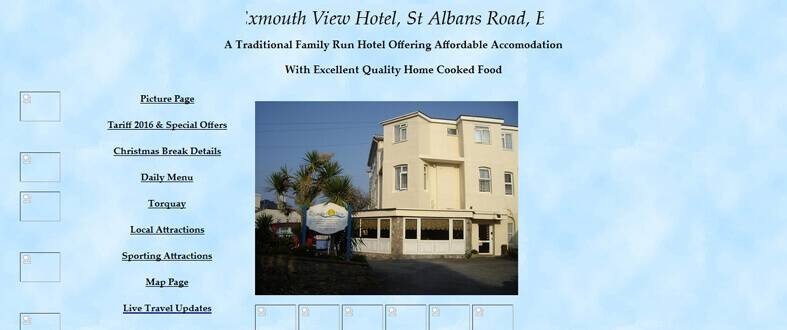
We are sure this hotel has lost quite a few guests after they checked into their website. If you want to get a crash course on “cheesy website design”, please check out the Exmouth View Hotel website. This may just be the worst hospitality website on the internet. If you want to scare off your guests in the recreation attempt of Bates Motel, definitely derive inspiration from this one.
The color combination makes you wish that you had your RayBans on right now. The grey and black interspersed with bright red and white makes us wonder if the designer was colour-blind. If the website designers were thinking of recreating a brutalist website design, they have failed miserably at it. This website has no sense of minimalism. The pages are overcrowded with content and low-res pictures, which make browsing a pain. Also, the logo on the main page does not match the logo on the rest of the pages.
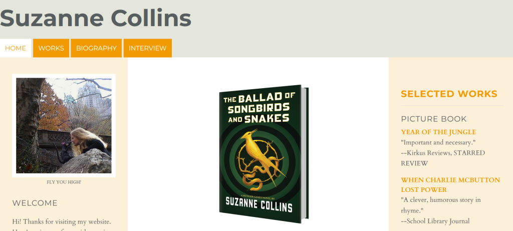
Nothing seems really wrong here, only the website of a popular author looks like a Tumblr blog. Nothing wrong with Tumblr blogs, but if you write a series like the Hunger Games, you need to up your game a little bit. The website is too simple, the colors and layout are outdated, and the author’s image is unclear. When people want to visit the author’s website, they want to see something exciting. A more modern design will fit the theme of this writer’s work.
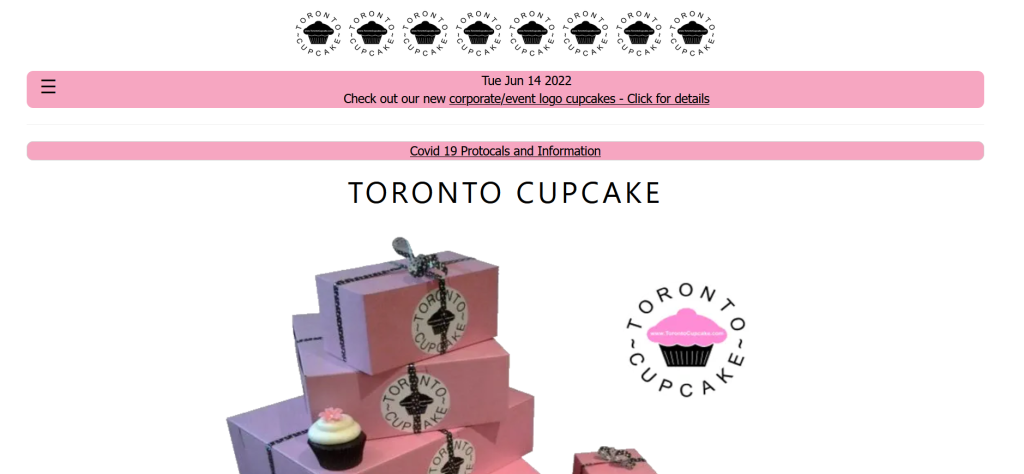
This website is a good effort but it doesn’t seem professional. There is very little text to engage the visitor. The logo reads poorly and has an indistinguishable design. The color scheme seems to be some fine-tuning to really pop and catch attention. The website isn’t as responsive as it should be, which makes it less user-friendly for people browsing on mobile. All of the page access links for the homepage, about page, contact us page, etc, are at the bottom. The theme does fit the product but it is possible to find something better.
It is like someone designed this website more than a decade ago and failed to update it. It has a dark background, small text, pixelated images, and a bad logo. The entire layout just begs for the visitors to press the back button. The design is so outdated that few people would trust the information provided here.
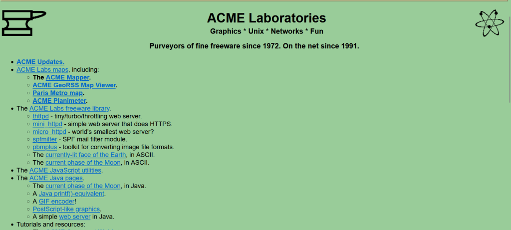
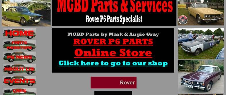
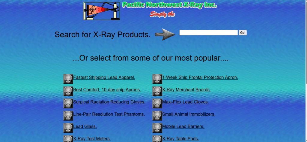
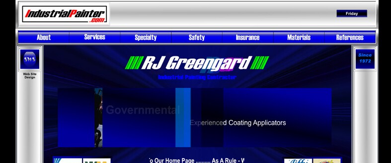
The website has been around since 1991, the company has been around since 1972. That’s an impressive track record when it comes to tech websites but that doesn’t mean the website is as impressive. The green background is dull, the text is small, the logo is generic, and the layout doesn’t generate much excitement. There is far too little content to truly grab people’s attention and encourage them to remain on the website.
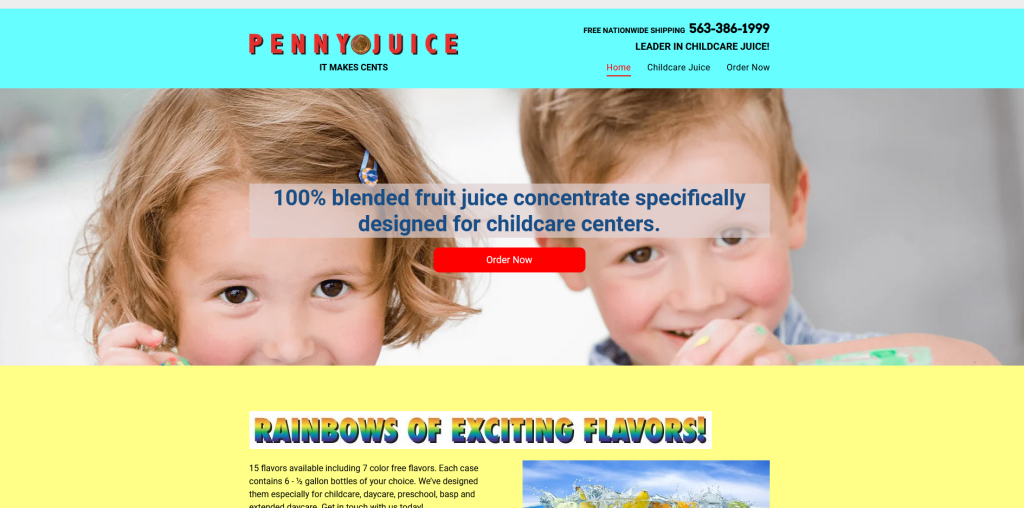
In the beginning, the website looks harmless enough. But as you delve deeper, you unearth the horrors that will make you scream and hope for a re-screening of The Conjuring for detox. Once you are in, your monitor will explode from all the colors. But in spite of all the distinct colors, the font choice leaves every bit of info illegible. If they were trying to be clever by including a juice concentrate theme for their website, they did it horribly wrong. The trauma will keep you off Penny Juice for a while.
This could somewhat qualify as a minimal, brutalist website if it had all the responsiveness and animation in place. We again sadly proclaim the use of animation that takes quite a few seconds to load and the lack of user-friendly navigation features. The links are crazy and make you wonder if you suddenly suffered from amnesia attacks after clicking the logos on the main page. This is a truly strange website that keeps the purpose a mystery.
Once your eyes settle and start finding pattern in the chaos, you may unearth some precious gems here. But the initial shock is too much for many. An average first-time user lasts about 2 seconds on this worst website before leaving in horror. The content and layout are too overwhelming. We think this website has great potential and content that is in immediate need of some spring cleaning.
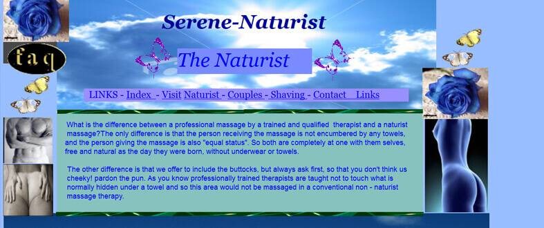
If the pictures of stone busts and random butterflies dancing around the screen do not get you in the mood for a massage, do not blame yourself. Far from curing your headache, the layout, choice of fonts, and navigation options of the Serene Naturist website can give you a fresh headache. Also, we are really not sure if including pictures of naked butts and bare chests sends out the right kind of message to their perspective clientele.
If you were a doctor, would you hire this clinic based on this website? It is outdated, mildly terrifying, and utterly uninspiring. The animated logo seems like it comes from the neon part of the 80’s. The list of links barely stands out from the background image. The background image is bland and outdated. There is nothing that grabs attention or encourages trust. It isn’t a website that a diagnostics company should have.
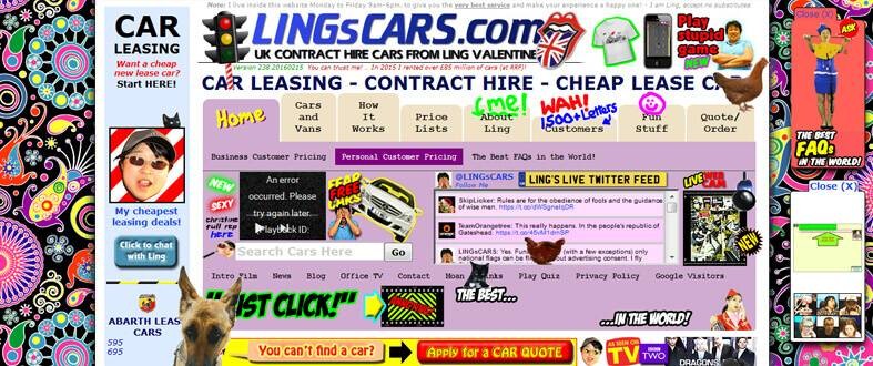
This worst website will give you a taste of the 70s, the LSD and Molly trips, and not in a good way! The neon backgrounds and music that would have made Helen Keller see and hear. The entire purpose of the website is to offer cars for leases, but with the trotting chickens and Dalek webcams, you will hardly have the attention span to notice any. It is utter mayhem that rages throughout the website and obscures the actual content and services offered by Ling’s.
Again, at first glance, this is a modern-looking and clean website. It is certainly not as bad as some of the options mentioned on this list. However, when you attempt to use the website, issues start becoming noticeable. There is a distinct lack of whitespace available that can make touchscreen navigation difficult. The content isn’t organized in an optimized fashion, which makes the browsing experience feel cluttered. However, the issue is relatively easy to fix and the owners just need to add some space to give the page more breathing room.

This website has a very outdated feel as well. Not as retro as some of the websites on this worst website list but you can tell this page was created ages ago and needs some spiffing up. The design is simply very outdated and doesn’t inspire confidence. If a competitor has a more current-looking platform, they will have an edge over this and attract more customers.
A different theme and some restructuring will give this website an edge and make it look more authoritative.
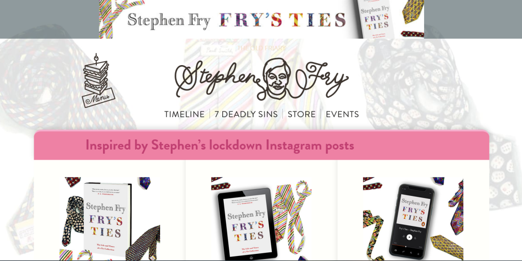
Stephen Fry is an amazing human being but his website is not so amazing. The background and website elements overwhelm the content and distract the reader. The theme is a little too messy and you don’t know what you want to focus on. It requires a better structure and more coherency along with a better color scheme to make the page appear more modern.
It’s hard to understand how an organization dealing in the business of colors aka paints, can choose blue as their website’s dominant color. And note it, these are the kind of blues that will choke your eyes out. What’s worth having a split for is their right-hand tab leading one to the HTML site. The point in question is why go for a flash website when it is not flashy at all?
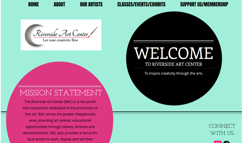
Well, you can kind of get the theme, if you squint. The color circles may seem like art or blobs of paint. But for an art center, this website is not very inspiring. The logo is outdated, the background and theme are a little dull, and the layout isn’t as cohesive as it should be. Not too bad, but there is a lot of room to improve. A good hero image would be nice, especially if it is a sort of impressive artwork that reflects what people can expect.
Clearly a Star Wars fan designed this. The video on the homepage event has the Star Wars scroll text. If you’re a Star Wars fan, maybe the website will excite you. If you aren’t, this website will feel old, over top, and fan boyish. The menu buttons have very small text and are tucked away in a corner like they’re a secret. The design is dark, there are too many distracting elements, and everything feels very cluttered. A website should be sleeker and easier to understand at a glance. There are many reasons to put this on a bad websites list.
Who is Jami Lin? No, that’s not curiosity talking. It’s the kind of eenie meenie the banner of this website plays on visitors, what with five feminine faces. It appears like a first-hand teaser into what a dot com doom would look like. Plus, highlighting keywords with bold shades of blue sure as heaven is enough to make one run for life while he can.
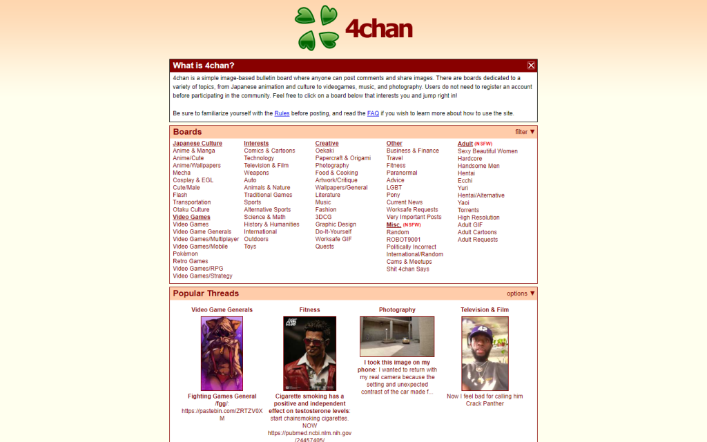
Oh jeez, where to even begin? The entire website looks like a dull bulletin board, there are no images, a boring logo, and there is no way to determine which information is more important. This looks less like a website and more like White pages. Nothing about it inspires trust not that people actually trust 4chan. You’re just bombarded with a wall of links to different pages.
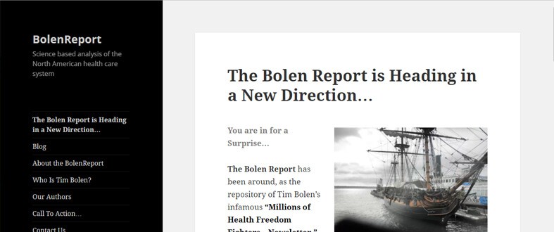
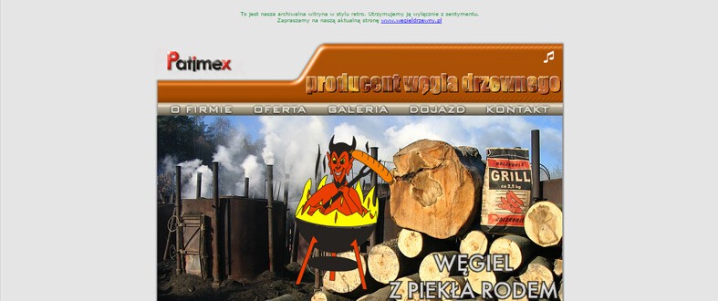
There is a way here for you to learn how old newspapers were edited. Or better yet, what layout designs the news world beginners would have had rejected. Going black and white is also an art, even though black and white are not considered as colors. There is a reason we kept what we kept away from you. It is the old Bolen Report website built on Microsoft Front Page. As it turns out some people really don’t learn from their old mistakes.

Bless our fates for 007 is fictional. Had he been real we would know instantly just where he would be headed next, but not before trying to figure out what exactly this website has been using his name for. There are high chances he would simply stab himself just looking at those bold blue headlines. If all goes well, the only thing making to the museum will be this cringe-worthy website.
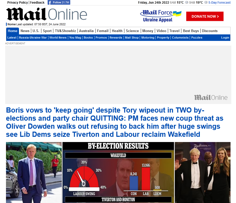
The Daily Mail is a well-known name and the website layout is fairly typical for a news media website. However, there are just too many ads here. The website does offer a pleasant user experience at all with ads covering most of the screen and disrupting the user when they simply want to read news. Fewer ads and more strategically placed ads can help.
This website has small font, an outdated layout that looks like it is from old WordPress days. The information is current but the design is so outdated that it is nearly impossible to trust it. The layout isn’t streamlined or coherent either. Elements aren’t placed in an orderly fashion so everything looks cluttered. There is little whitespace so mobile navigation is a bit tricky. Not to mention, the search bar looks more like a log-in form, which can be confusing.
This website doesn’t even take up the entire browser screen space. The buttons to different pages look like they are 20 years old. The images look like they have been taken by a decade-old camera. There is very little text to tell us why we’re on the website and what it contains. The small page that sticks to the top left corner of the browser window is barely big enough to read comfortably. Sadly, the experience on mobile isn’t any better. This is definitely one of the top worst websites online today.
Exactly what does the website offer? You can’t really tell. There is no introductory text on the homepage and all links look suspicious and unconnected. The design is like a word document with different website elements pasted on it. It doesn’t look like a website, more like a school project and even then, not the best school project. It is difficult to understand what this website seeks to achieve and worse still, you won’t feel secure clicking on the links to know more.
Ready for a good laugh? This one has had over three hundred and eighty million views in spite of being voted one of the worst websites. And now we know why. The worst there is to learn about the kind a worst website should be, take the notes right off this one. Though a yellow over blue color scheme sure might lend a 70s vibe, the images will leave you feeling dumped with web poop.
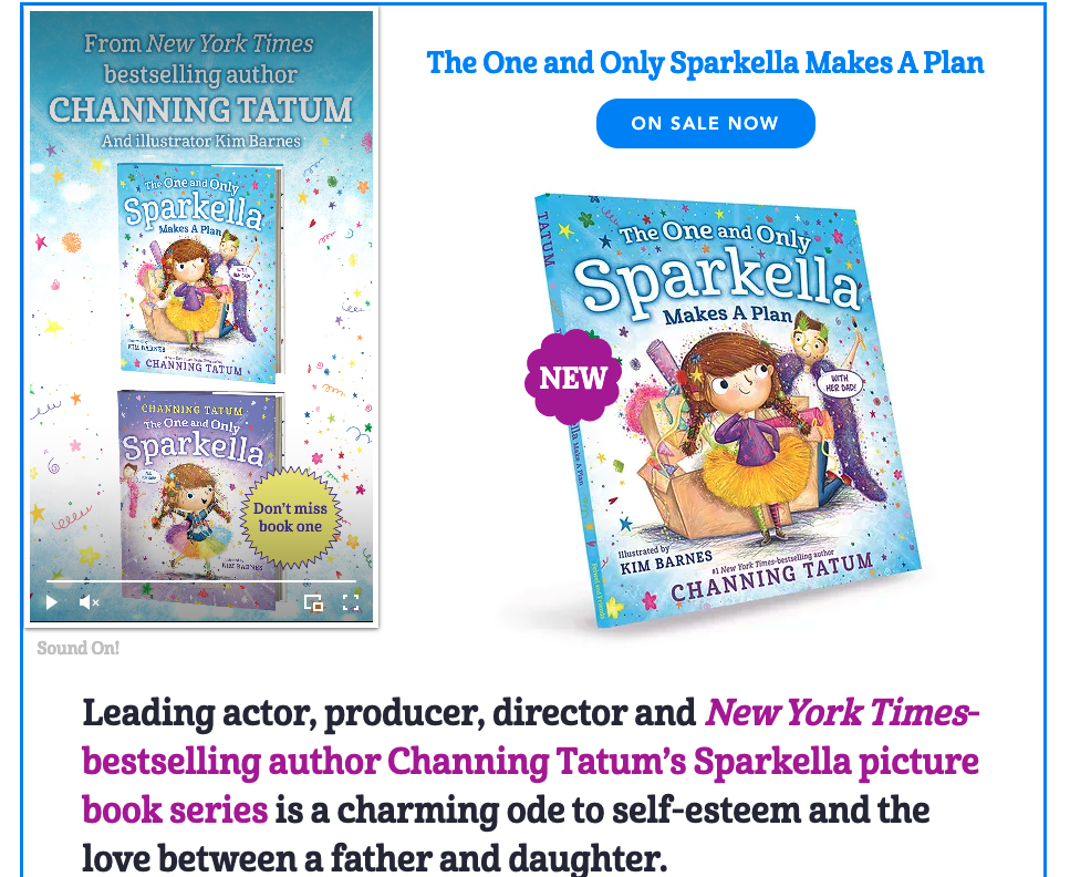
This is a website for Channing Tatum’s children’s book. The book has great art and illustrations, the story is charming. But the website doesn’t represent this accurately. The dull blue background and the lack of any header image makes this site look outdated. The layout is similar to an old blog and there is nothing sparkly or cute to attract children’s attention. A little more spiffing up and a few decorative touches done with the target audience in mind can help.
The only thing which lifted our spirits was the fact that the root cause of this website’s existence still is the sentiments attached to it. It’s difficult to understand what and why. The realization coming handy off this website is the fact that special effects in the brand name are not cool, especially when backed by music. Off script, their new website is a sigh of relief still.
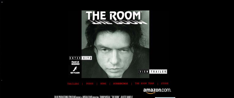
No doubt the IMDB rating of this movie called The Room is only two stars out of five. Had there been a similar rating for this website, the numbers would have been in negative. Though, they definitely need someone to explain that an excessive use of ‘coming soon’ would not make the ‘coming soon’ come sooner. And just what’s with the center alignment and bold highlight? The Room Movie, take a break already.

The worst example of creativity block can be seen right on this website. Adding a background image with cloudy sky for a website called cloud 9 is simply brilliant. If at all adding one had been extremely important, as it appears, a smarter, pleasanter image would have changed the game for the better. Or not, like they say, a lot goes into building a structure and almost nothing into breaking one. And this one’s been long broken.

With such a flashy name, one’s hopes are sure to soar high just as much as they are to drop below the ground upon landing on their website. With close to no records, count three, even those piano keys on the sides can do nothing to save them from an evident doom. Glad, they served a preliminary warning to give reading those tiny words in electric blue over a black background a miss, for otherwise the less fortunate ones might be crying over their lost sight already.
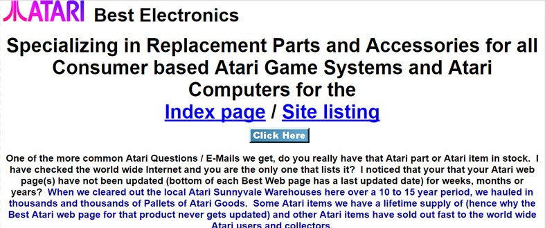
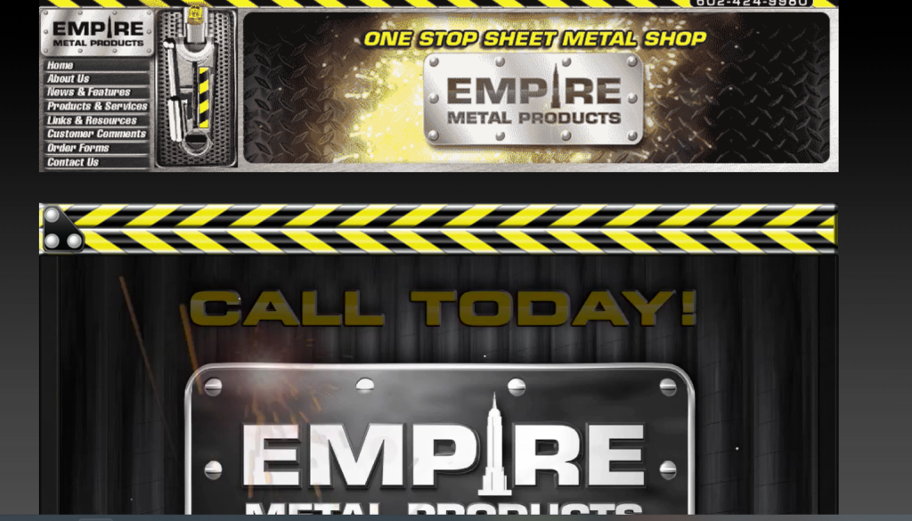
Reading a horribly written word document would still count as a holy grail in front of this worst website. Best electronic, they call themselves, with nothing to prove through their website. Introducing new products with no images whatsoever and a plain set of words counted under information makes it look like a storeroom to stuff their unused/unsold products.
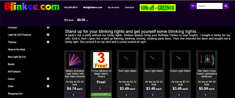
Remember the mesmerizing Christmas lights? Blinkee’s banner is going to give you your worst Christmas nightmare. As a website about body lights, something you will understand after minutes of scrolling up and down, it does nothing to light you up. The interface is vividly disappointing just as much as their payment gateway is purely annoying.
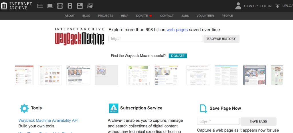
The Wayback machine is a very important website that helps millions of people find information that has been deleted or archived. However, the layout of the website is very cluttered and difficult to navigate. There are fewer white spaces, the header bar is overpopulated, and there is no hero image to immediately grab attention. The homepage doesn’t provide much information about the website. A cleaner and more purposeful layout with a more modern theme can help.
Though that name is ought to remind one of all the historical kinds of movies out so far, like the Braveheart to speak the least, this website will land one in the remains of flux. And no historian in any age can churn out the reason to why exactly have they left the right side of the side blank and soaked in black.
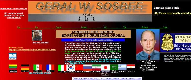
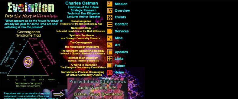
There is a strong resemblance between a spy’s crazy wall and this website. Trying to relay an Ex-FBI agents terrifying ordeal, this website has done more damage to the man than any organization could. Either this website had been born out of absolute amounts of untapped creativity, hence the disappointing scatter, or it had been the stab-in-the-back kind of death of an idea.
What exactly were they thinking? Their fickle mindedness has been evident from the very name of this website. The more scrolls down this page the more evident their fickle mindedness gets. Take, for instance, their choice of colors, which appear quite like a man saying – ‘dude, let’s go VIBGYOR’ and without a thought of his own, and the website developer followed.
This one comes bearing as awful a design as one can imagine, only worse. It’s possible they experimented with ideas while developing the website and then left all those experiments- like a single image of a painting, then a small collage of pictures and paintings, followed by a big collage of ghastly images, ending in a series of solo images- when they got bored and dumped the idea on the internet for people to waste their time on after they couldn’t take back theirs.
Were they planning on creating a game? Or were they out to make a motion picture? Alas, it was a message from the higher grounds telling people – ‘stay the farthest away from us, you mortals.’ Who knows what their plans had been, the only plan evident through the layout is to stab the onlooker’s eyeballs and knock ‘em out.
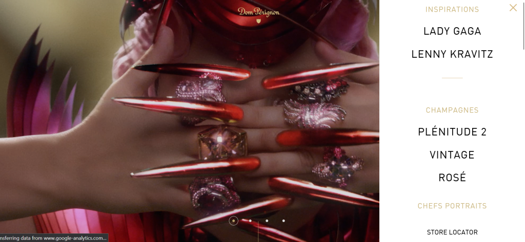
Stunning visuals on this website and there is no reason to believe the site should be on a bad websites list. However, the page does little to explain the product and provide relevant information immediately. A lot of focus is on the artist instead of the product, which doesn’t really help. The navigation and layout feel a little clunky and outdated too, despite the beautiful images. Surely a famous and respected campaign brand can do better.
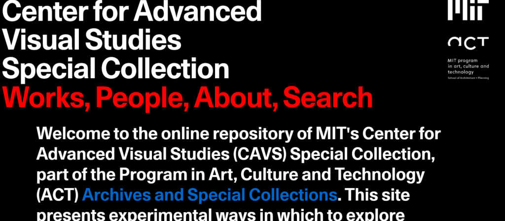
You don’t expect poor website design from one of the world’s more premiere education institutions but we have seen it twice on this worst website list. MIT’s Center for Advances Visual Studies may look like a good website at first glance but it is very difficult to navigate. There isn’t a good menu bar option and the layout is very non-traditional. Visitors are often left floundering, trying to understand where they can find the information they need. The odd scrolling is more off-putting than innovative.
Is it a cruise? Is it a spa? What exactly is it they are selling? Their customers could have spent a minute or two guessing the product had they only put decipherable words. Keeping that aside, who opts for a lime and tangerine combo over a turquoise background? But despite that, feel free to call them and check, at least that has been clearly displayed, in-your-face.

‘Skip-Intro’ is a risk worth taking if there is a dying urge to know what the 50th worst website in the world looks like. A disaster, if it had to be summed in two words.
That aside, this one appears quite fond of left alignment, or perhaps that’s all they cared to use. And boy, do they provide an option to download their website as a ‘Microsoft PowerPoint’. At your own risk, please.
Conclusion
Spotted several similarities between these sites and yours? Then it’s time to start thinking about how to refresh the site with a few adjustments. Moreover, if you go through our introductory section once more, you’ll know exactly what not to do when redesigning your website.
Still unsure about your website design but don’t want to make the same mistakes these website owners made? Then feel free to contact us.
Additional Resources:
This blog is having the general information. Got a creative work and this is
very different one. We have to develop our creativity mind. This blog helps for
this. Thank you for this blog
check the source code (press Ctrl+U) for lingscars.com its hilarious. He’s got his face coded into his Html its amazing lmao.
Yes, just checked that website. We can include that in our upcoming list update for year 2018. Thanks.
No mention of libertyvan.com? Or has that been mentioned before in past lists?
Kris, thanks for the suggested website. It really deserves to be in our list. We will soon be updating our list for year 2018.
Hi,
I enjoyed your your collection of ugly websites. It actually inspired me to research this topic specifically for dog breeders. It is a little known fact that there are many dog breeders whose site hasn’t been updated since the turn of the century.
So I gathered 12 breeder sites from 12 different countries. They will make you laugh. Please have a look at let me know what you think?
http://blog.wuuff.dog/12-worst-dog-breeder-websites/
Thanks,
Sandor
I saw your post. It looks good. Good Job!
There are 100s of websites which are of bad in a way or another. Putting them all in one list is never possible for anyone.
“such worst website designs”
That is what makes me cringe.
Thanks for sharing these wonderful blogs.
Many websites are available that look ugly but they earn millions and billions of rupees from it.
Here are some of the ideas to help those websites which are not working well https://www.elsner.com.au/what-is-the-secret-behind-the-high-rank-of-ugly-sites/